Mexico City’s metro icons
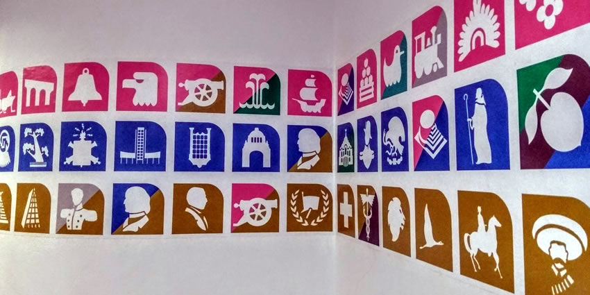
Each metro station in Mexico City is identified by a single icon. Created at a time when the country’s literacy rate was low and the capital’s metro system was small, the design concept was intuitive and easy to execute.
Since one-third of Mexico’s population could not read or write, and most of the rest had not completed high school, it was thought that visitors would find it easier to navigate a system based on colors and visual signs.
Today, Mexico’s literacy rate has risen to just under 95%, and Mexico City’s metro system has grown to 12 lines and 195 stations. However, an icon system based on modern and ancient associations with the built environment has survived.
The metro’s icons were suggested by graphic designer Lance Wyman during the development of the transport network. His team created icons for the first 3 lines. Logos are associated with the name of the station or the area around it.
As the network expanded, additional icons weren’t always so clear.
As Lance Wyman said in 2015:
What’s happened now is that some of the icons of the station depend more on depicting things that come out of Aztec cultures, things that even the Mexican population would have a hard time describing as far as what they are, so there’s a weak area. But it still works.
The Collective Transportation System tweets almost one badge a day with an explanation for each. Why is Talismán station represented by a mammoth? Because workers discovered the remains of one while excavating the site.

The logos are not assigned at random, rather, they are designated by considering the surrounding areas, such as:
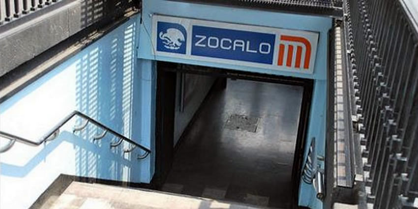
- The reference places are located around the stations (e.g., the logo for Salto del Agua fountain depicts a fountain).
- The topology of an area (e.g., Coyoacán – in Nahuatl “place of coyotes” – depicts a coyote).
- The history of the place (e.g., Juárez, named after President Benito Juárez, depicts his silhouette).
The background colors of the icons correspond to the colors of the line served by the station. Stations serving two or more lines display the respective colors of each line in diagonal stripes, as in Salto del Agua.
With the technology we have, it really does make sense to hang on to the idea of using icons. You can give context and then you can go to the icon, get to the station, and go to Google Maps if you want to see what’s happening at that station area.
We navigate our lives now with icons, illiterate or not. Now it’s a matter of designing the systems and designing better icons and better systems of using them, and that’s just a lot of fun for me because I was in it from the very beginning. When it works, it’s like writing poetry. You capture the essence of something that’s important, and it’s nice because there’s immediate feedback.
The logo system was adopted for the Guadalajara and Monterrey metros, and recently for the Mexico City Metrobús. Although logos are no longer necessary due to literacy being now widespread, their usage remains.
Download the Mexico metro map (.pdf)
Let us know if this article was useful for you